 +91-8727000867
 +64 22 003 5555

Home - Scripts - Website Development
- 04 December 2025
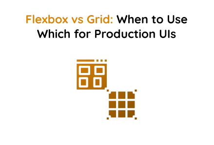
Flexbox vs Grid: When to Use Which for Production UIs
In modern web development, creating responsive and visually appealing layouts is crucial. Flexbox and CSS Grid are two powerful CSS layout systems that assist developers in achieving this. This HTML and CSS project showcases their differences through a futuristic, radar-themed design with animated effects, clearly illustrating the distinction between one-dimensional and two-dimensional layouts.
Whether you are offering web design services, custom web development, or website development services, understanding when to use Flexbox or Grid is crucial for creating production-ready user interfaces.
Flexbox Section — One-Dimensional Layout
Flexbox is perfect for layouts that require alignment along a single axis—either horizontal or vertical. This project uses Flexbox to arrange content cards in a responsive, flowing manner
How It Works
Flexbox arranges elements in a row or column. With flex-wrap: wrap, items automatically flow to the next line when space is limited, making layouts responsive. The gap property ensures consistent spacing between elements.
Key Takeaways:
- Ideal for single-axis layouts.
- Provides control over alignment and spacing along one axis.
- Excellent for responsive card layouts, navigation bars, or toolbars.
- Essential knowledge for creating efficient custom web development projects.
Grid Section — Two-Dimensional Layout
CSS Grid is built for layouts needing both rows and columns. It enables precise placement of elements and is ideal for complex interfaces.
How It Works
Grid layouts are two-dimensional, enabling elements to be arranged across rows and columns. The grid-template-columns: repeat(3, 1fr) property creates three equal-width columns, and gap manages spacing both horizontally and vertically, unlike Flexbox, which operates along a single direction axis.
Using CSS Grid is essential when providing professional website development services that demand precise layouts, such as dashboards, galleries, and complex page designs.
When to Use Flexbox vs Grid
- Flexbox: Ideal for one-dimensional layouts where alignment along a single row or column is needed. Examples include navigation bars, horizontal card rows, and toolbars. Using Flexbox can enhance efficiency in responsive web design service components.
- Grid: Ideal for two-dimensional layouts where content must align in both rows and columns. Examples include dashboards, image galleries, and complex page layouts. Custom web development projects often leverage Grid for detailed control over layout design placement.
By understanding the strengths of each system, developers can select the appropriate layout technique for production UIs. Combining Flexbox for simple axis alignment with CSS Grid for complex multi-axis layouts ensures that interfaces are responsive, visually organized, and user-friendly.
Final Words
Flexbox and CSS Grid are essential tools in a modern developer’s toolkit. Flexbox is effective for simple, one-dimensional layouts, while CSS Grid is ideal for complex, two-dimensional designs. This project clearly highlights their differences with a responsive, futuristic style, providing a practical guide for using these layout systems in web design services, custom web development, and website development services.
Using the right layout system can enhance user experience, improve responsiveness, and make your websites more maintainable professional.
 Frontend
 Backend
 Deployment
Recent Scripts
SaaS Tenant Onboarding in Laravel (Seeds & Tours)
 by Sunil M.
–
February 26, 2026
–
3 minute read
by Sunil M.
–
February 26, 2026
–
3 minute read
Single Sign-On (SSO) Implementation in Laravel (SAML / OAuth2 / OpenID Connect)
by Sunil M.
–
February 19, 2026
–
3 minute read


 Request Instant Call
 Hire Remotely